VoGro Mobile App

PRODUCT DESIGN · RESEARCH · UX DESIGN
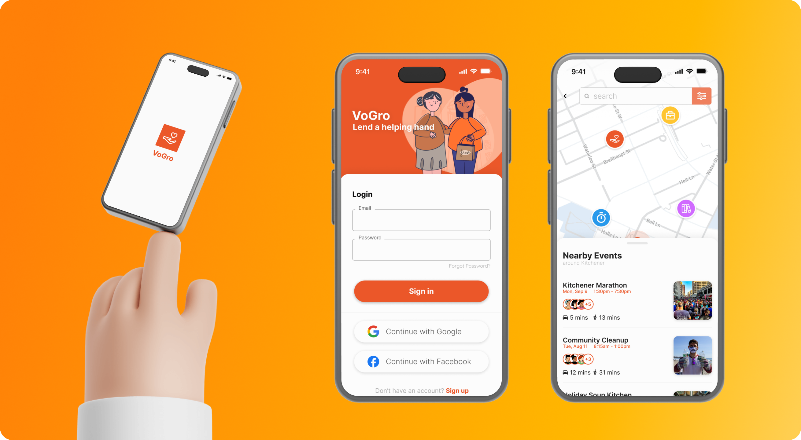
VoGro product image

INTRODUCTION

VoGro is a volunteer management platform, initially designed to improve the lives of those impacted by the pandemic. The platform evolved, encompassing community and social opportunities as well. We wanted to make this platform as accessible as possible. Following the development of our dashboard, we set out to design and develop VoGro’s mobile app that enables a helping hand.

MY ROLE

Research, analysis, product design, mobile design, user-testing

TOOLS

Figma, Illustrator

TIMELINE

Nov 2022 - Aug 2021

PROBLEM STATEMENT

VoGro was created to help the community and aid those limited by the pandemic and its restrictions. VoGro was struggling to connect volunteers with community opportunities. How might we bring opportunities to volunteers in the midst of a pandemic?

BREAKDOWN OF THE PROBLEM

🔎 Volunteers are unable to find opportunities

Our dashboard and website platforms are not effective at recruiting new users or connecting them with volunteer opportunities.

😕 New users are often confused and do not follow through
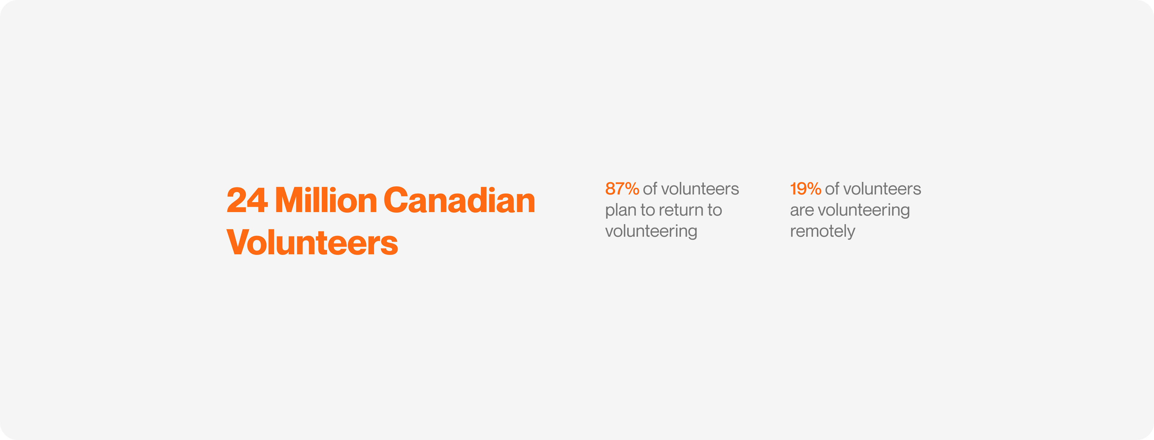
The new users we were bringing in found that our website and email system were inefficient, and often confusing.

VoGro industry statistics

LETS DO OUR RESEARCH

Step-one was looking into what was out there, the different volunteering platforms on the market. We were looking into what worked, and what we could improve on.

Our main users include high-school and university students as well as young adults for volunteers. The elderly and charities made up the other part of our user base. Our research was focused on helping these groups. We came up with three main features, a task map feature, news and updates, and a chat feature.

Other companies in the volunteering market
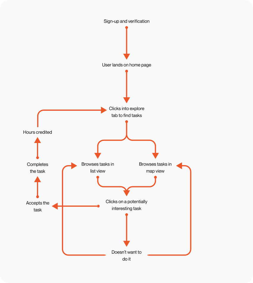
VoGro user journey map

Step-two was finding out what are the users saying.

Our main users include high-school and university students as well as young adults for volunteers. The elderly and charities made up the other part of our user base. Our research was focused on helping these groups. We came up with three main features, a task map feature, news and updates, and a chat feature.

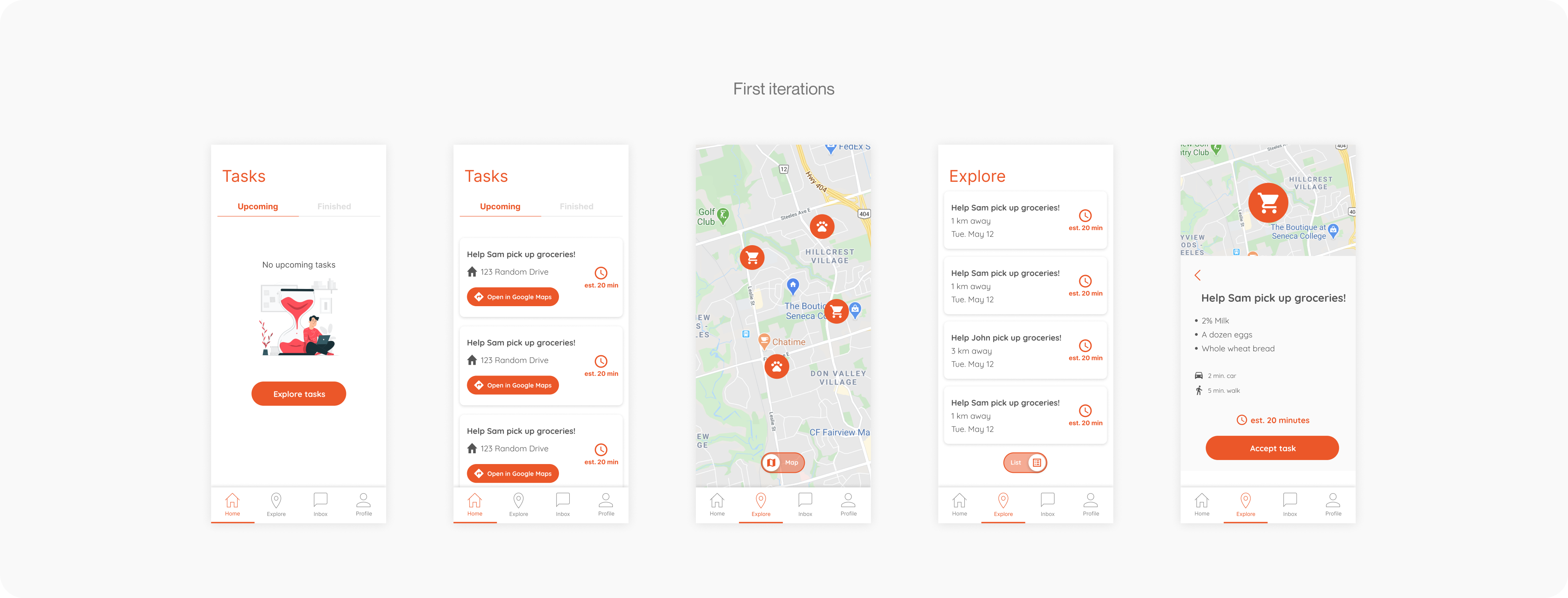
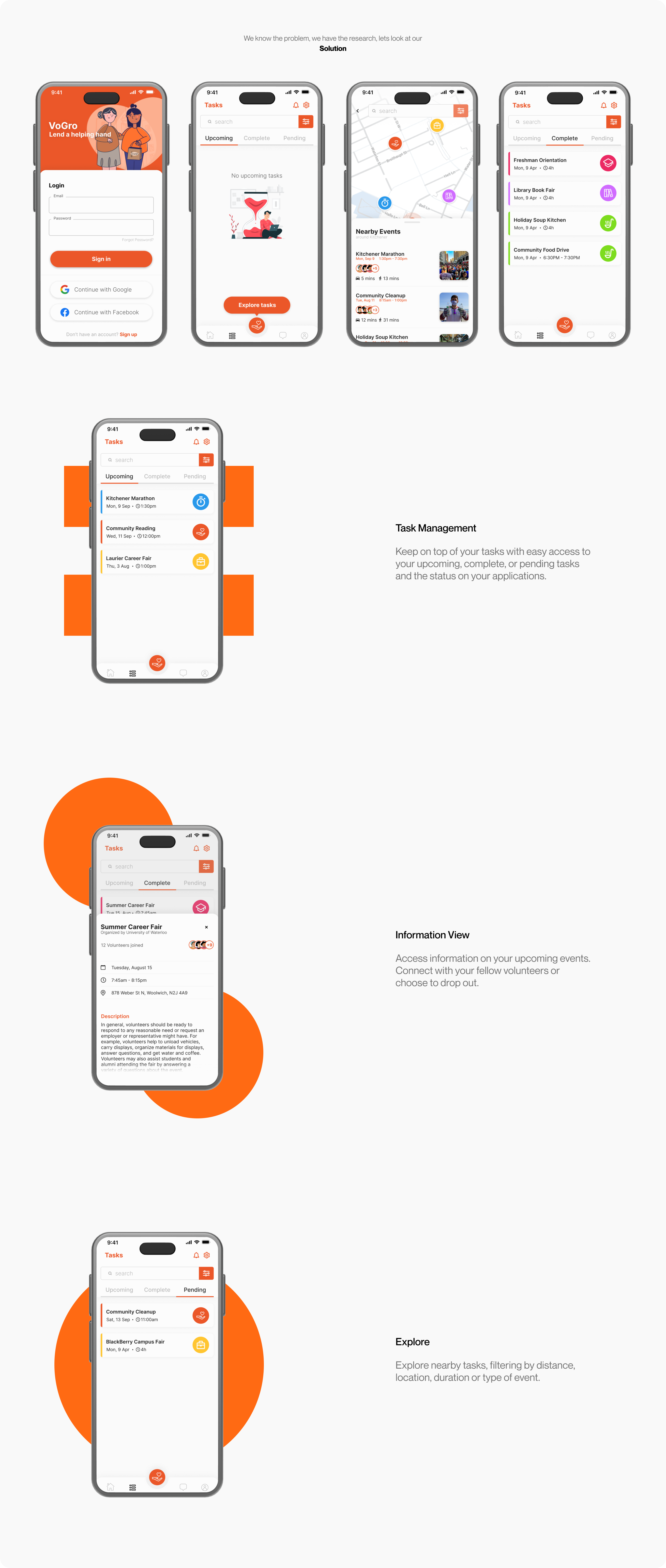
VoGro first iteration designs

Following the style guide and design system created by the web design UI team, I created these screens as our first Iteration. This Iteration only included the core features from our planning phase, allowing users to carry out their primary goals

VoGro iteration image

FIRST ITERATION

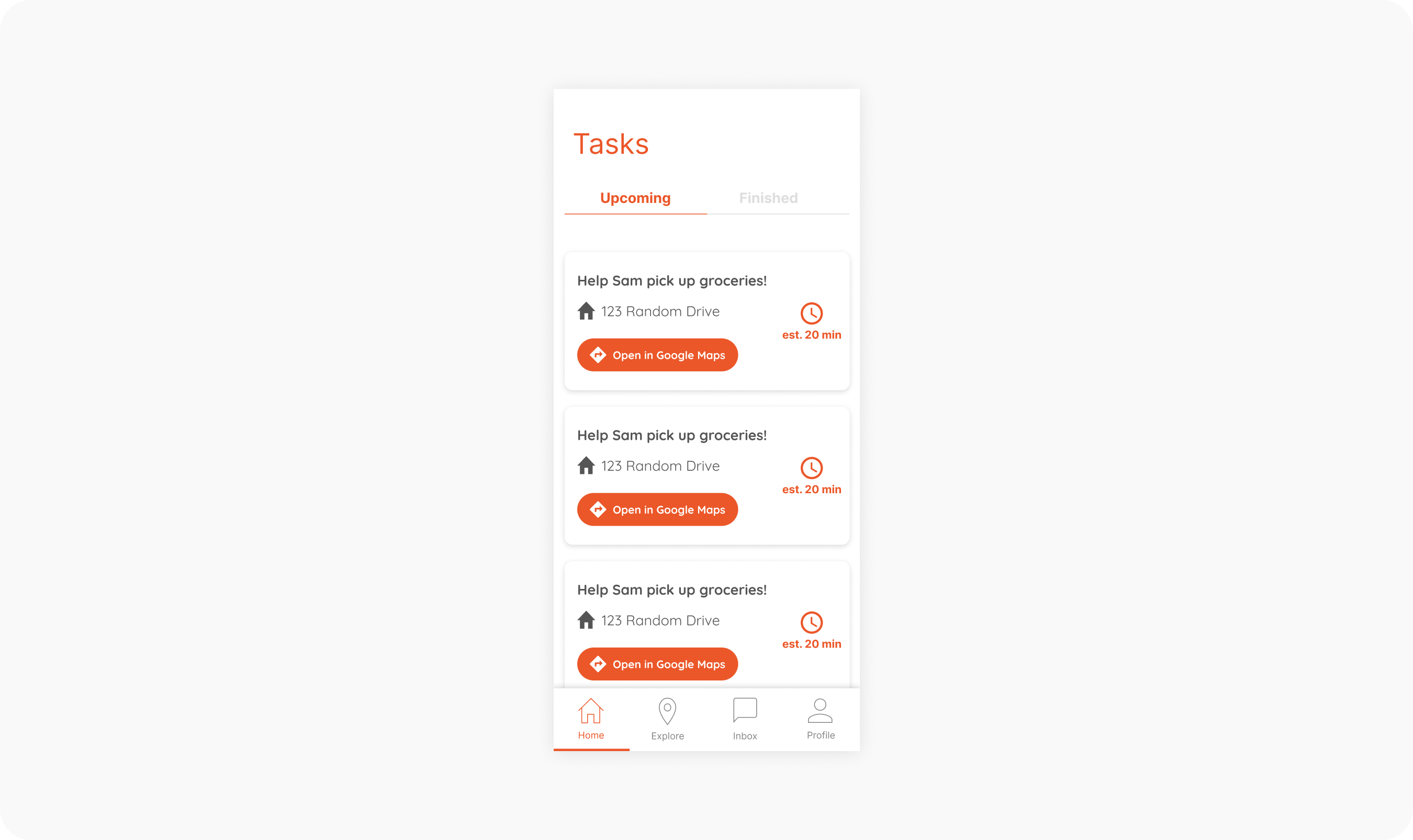
Make it as easy as possible for users to track their tasks

An important feature we wanted to implement is our task tracker, which provided users the ability to stay up-to-date with their commitments and track their volunteer hours.

FIRST ITERATION

Visualize distance and location when exploring

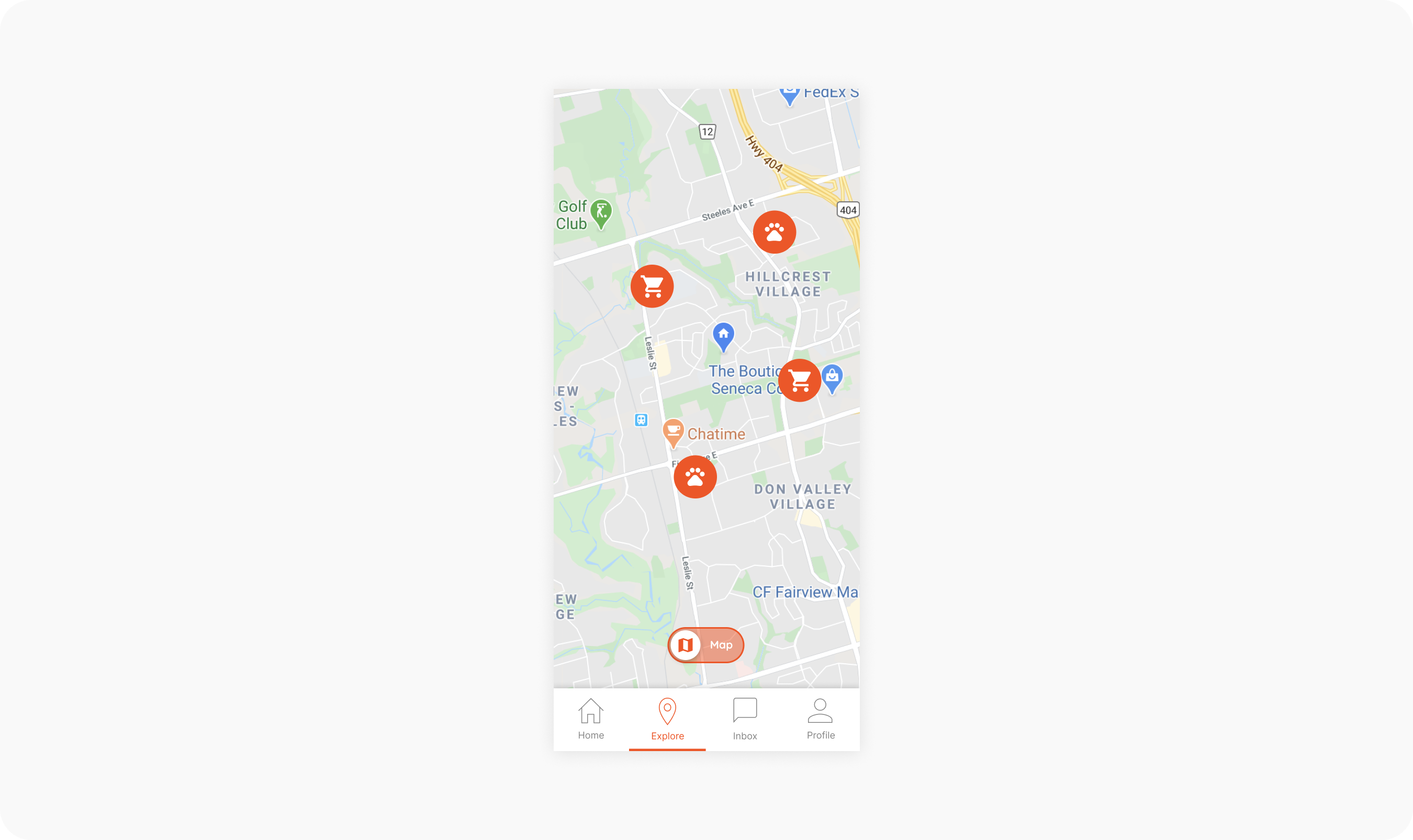
We built a familiar map feature that gives our users a visual representation of their location. Understanding how far, and how much time that might be committed was a large influencing factor for volunteers.

VoGro iteration image

FIRST ITERATION

Actionable and Informative

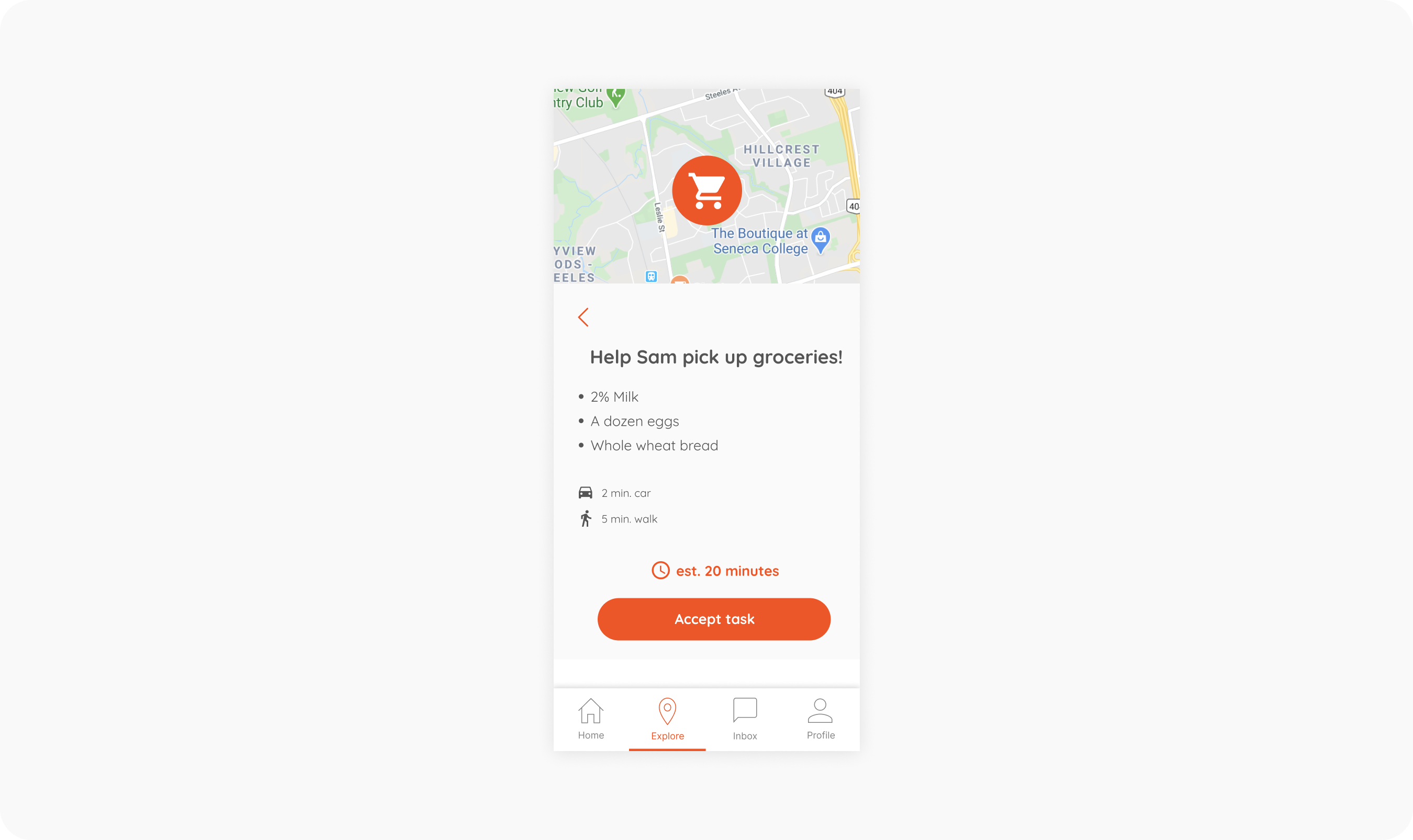
It is important our users know how and what they are committing to. We wanted full transparency between event hosts and the volunteers. It is important that volunteers know all necessary information and are able to accept upon interest.

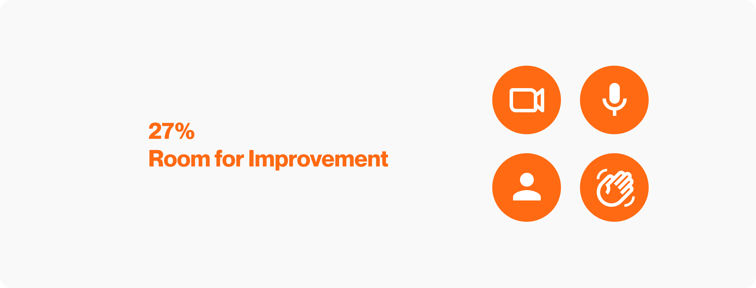
27% Room for improvement

USER TESTING

We tested our first iteration with a group of 15 members, all of who were either active or formerly active volunteers.

The primary goal was to enable the success of members in finding and accepting tasks. The group was given a prototype via Figma and monitored/recorded over a discord video call as they completed tasks given to them. The metrics of this study were:

  • Task completion rate

  • Ability to find certain tasks

  • User satisfaction

GIVEN TASKS

  1. Find and accept a specific task using map view

  2. Find and accept a specific task using list view

  3. Successfully cancel your application for a task

  4. Navigate to your messages and get in touch with your team

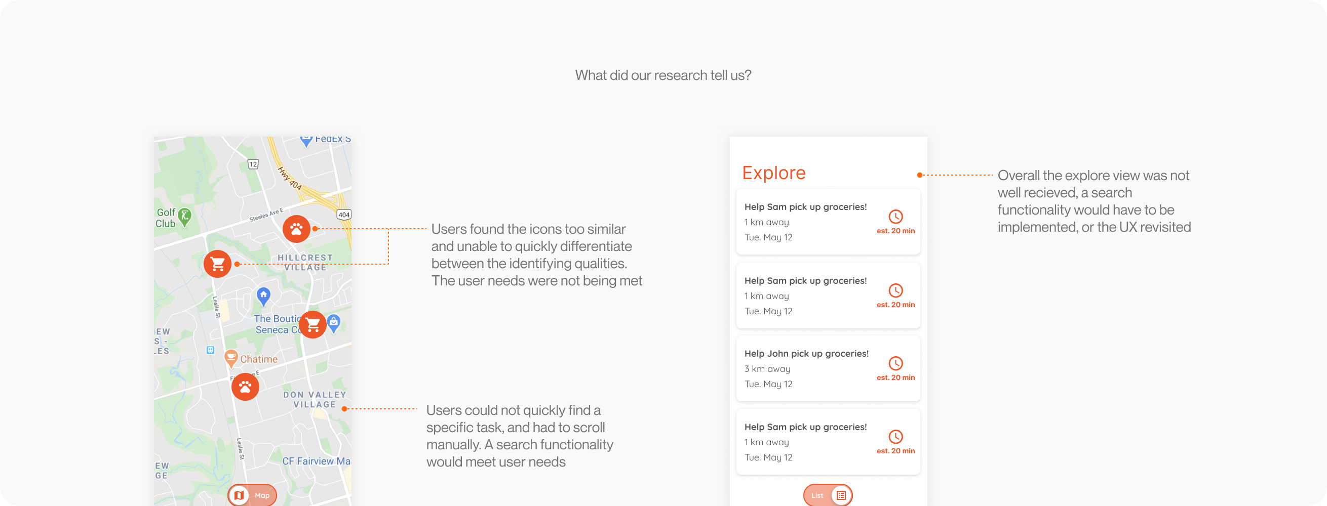
Overall users found the designs easy to follow and were able to complete all tasks given to them. The problem areas of the designs were found in the in-between of the process. Our group reported only a 73% satisfaction rate going through the processes of the given tasks, despite the 100% completion rate.

What we learned from our research
VoGro final designs

Room for improvement? For sure!

Iterate, Iterate, Iterate. I am happy with the journey and final product of the VoGro app, but in hindsight could have tested and iterated more. We jumped from the first iteration to the final product with only one user testing session, seeing major changes in the UX and UI, and I think if we iterated more and kept building we could create something even better.


Keep it Simple Stupid. In the early stages, I was exploring too many options and possible features, trying to have the “perfect” application. I ended up re-imaging the entire app at least four times with each new concept being more complex than the last. In my next project I’m going to focus on the core features of the application and ask myself, “is this something we need?”.

Next project